Degradation analysis: estimating when an in-service asset will fail
Classical life-data analysis has an awkward requirement: things have to fail before you can learn anything. You collect failure times, fit a Weibull, and out comes a picture of how the population behaves. It works — we've written about it before — but it has two problems that every practising reliability engineer runs into.
First, good failure data is scarce. If your maintenance programme is doing its job, most components are replaced before they fail, so the failures you'd need to fit a life model barely exist. Second, and more fundamentally, a life model describes a population. It tells you that the average bearing lasts 6,000 hours — it says nothing about the specific bearing in truck 12, which might be wearing twice as fast as its siblings.
Degradation analysis fixes both problems at once, and it does it with data you probably already collect.
Failure is usually the end of a measurable process
Most failure modes worth managing don't arrive out of nowhere. They're the final moment of a physical process that has been quietly progressing for months, and that process usually leaves a measurable trail:
- Brake pads and cutting tools wear — thickness lost per operating hour.
- Cracks grow — length per load cycle.
- Batteries fade — capacity lost per charge cycle.
- Insulation degrades — resistance drifting downward.
- Filters clog — differential pressure creeping up.
In every case there's a degradation measure you can read during a routine inspection, and a threshold beyond which the item is considered failed: the pad's minimum legal thickness, the critical crack length, the minimum acceptable capacity. The item doesn't have to fail for you to learn from it — every inspection is a data point.
That's the core move of degradation analysis: instead of modelling failure times directly, model the path each unit takes toward the threshold, and treat "failure" as the moment the path crosses it.
From measurement histories to a life model
Suppose you've inspected six brake-pad sets over their lives, recording wear at each service. Plotting measurement against operating hours gives you six degradation paths — one per unit — all marching toward the 8 mm wear limit:
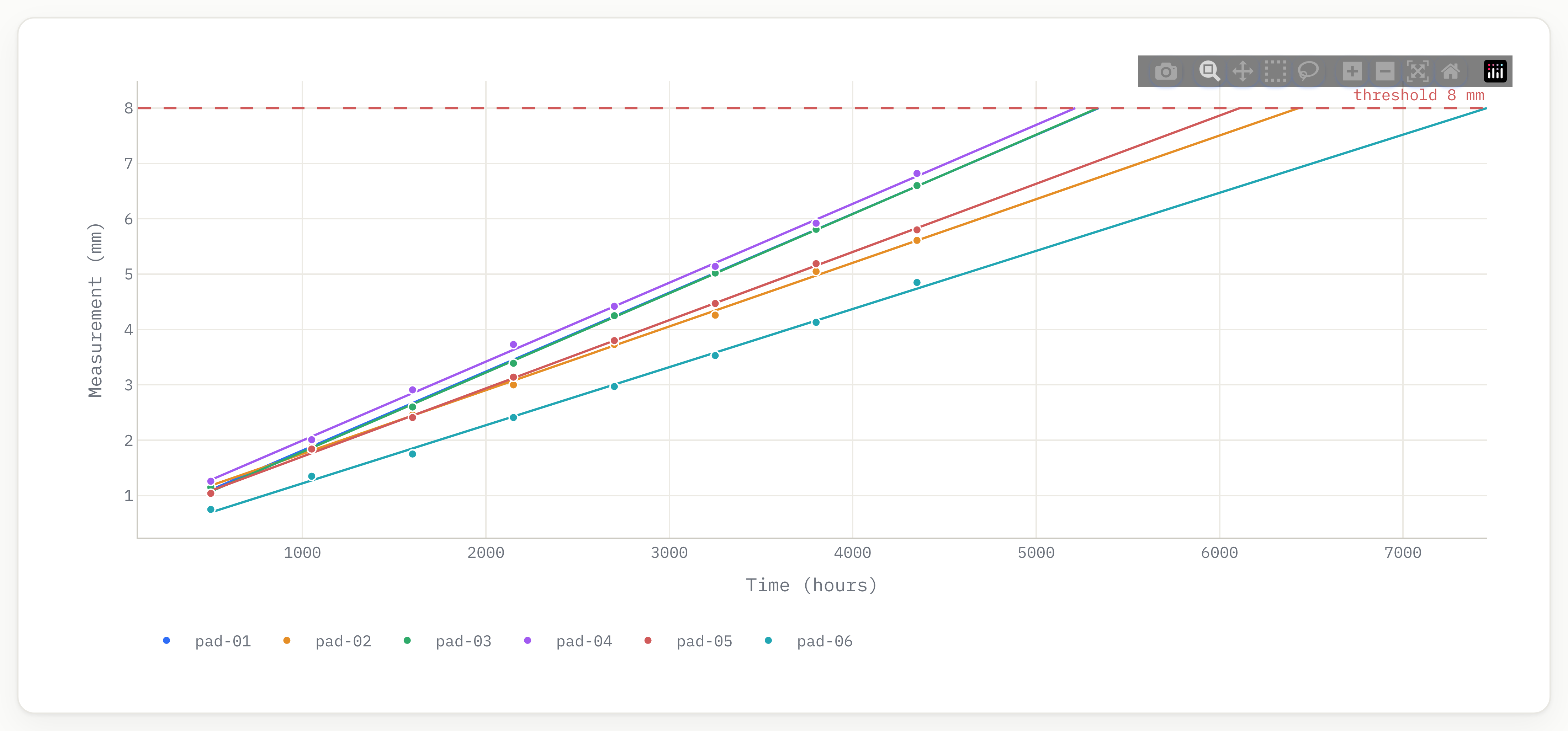 Six units' wear histories with fitted linear paths. The dashed line is the failure threshold; where each path crosses it is that unit's pseudo failure time.
The analysis then runs in three steps, following the approach Lu and Meeker made standard:
1. Fit a path model to each unit. A functional form describes how the measurement evolves with time — linear for steady wear, exponential for accelerating growth (crack propagation), logarithmic or power forms for processes that slow down. Reliafy fits the form you choose to every unit's history, or auto-selects the best form by information criterion if you'd rather let the data decide.
2. Extrapolate each path to the threshold. Where a unit's fitted path crosses the failure threshold is its pseudo failure time — the failure time it would have had, even if you retired it early. This is the trick that makes sparse failure data irrelevant: a unit that never failed still contributes a full data point. In the example above, pad-01 crosses 8 mm at roughly 5,300 hours; pad-06, the slow wearer, doesn't get there until past 7,400.
3. Fit a life model to the pseudo failure times. Those crossing times form a failure-time sample like any other, so a Weibull (or lognormal, or whatever suits the physics) fits directly. Now you have everything a conventional life model gives you — B10 life, characteristic life, failure probabilities over any horizon — obtained largely from units that never actually failed.
The population's unit-to-unit scatter carries through the whole chain: the spread in fitted path parameters becomes the spread in pseudo failure times, which becomes the shape of the life distribution. Fast wearers and slow wearers both leave their mark.
The part that matters: your in-service items
The population model is useful — it sets replacement budgets and stocking levels. But the question a maintenance planner actually asks is more pointed:
This pad, on this truck, measured at 2.6 mm of wear after 2,000 hours — when will it cross the limit?
This is remaining useful life (RUL) estimation, and it's where degradation analysis earns its keep. The idea: the population model describes what paths are plausible — how fast units tend to wear, and how much they vary. Your item's own measurements then pin down where it sits within that population. Two readings from truck 12 are enough to say "this one's tracking slightly slow of average", and the population statistics fill in the rest.
Formally, the item's path parameters get a posterior distribution: the population acts as the prior, the item's measurement history is the evidence. Projecting that posterior forward gives a fan of possible futures for the item, and where that fan crosses the threshold is the item's failure-time distribution — not a single guess, but an estimate with honest uncertainty attached.
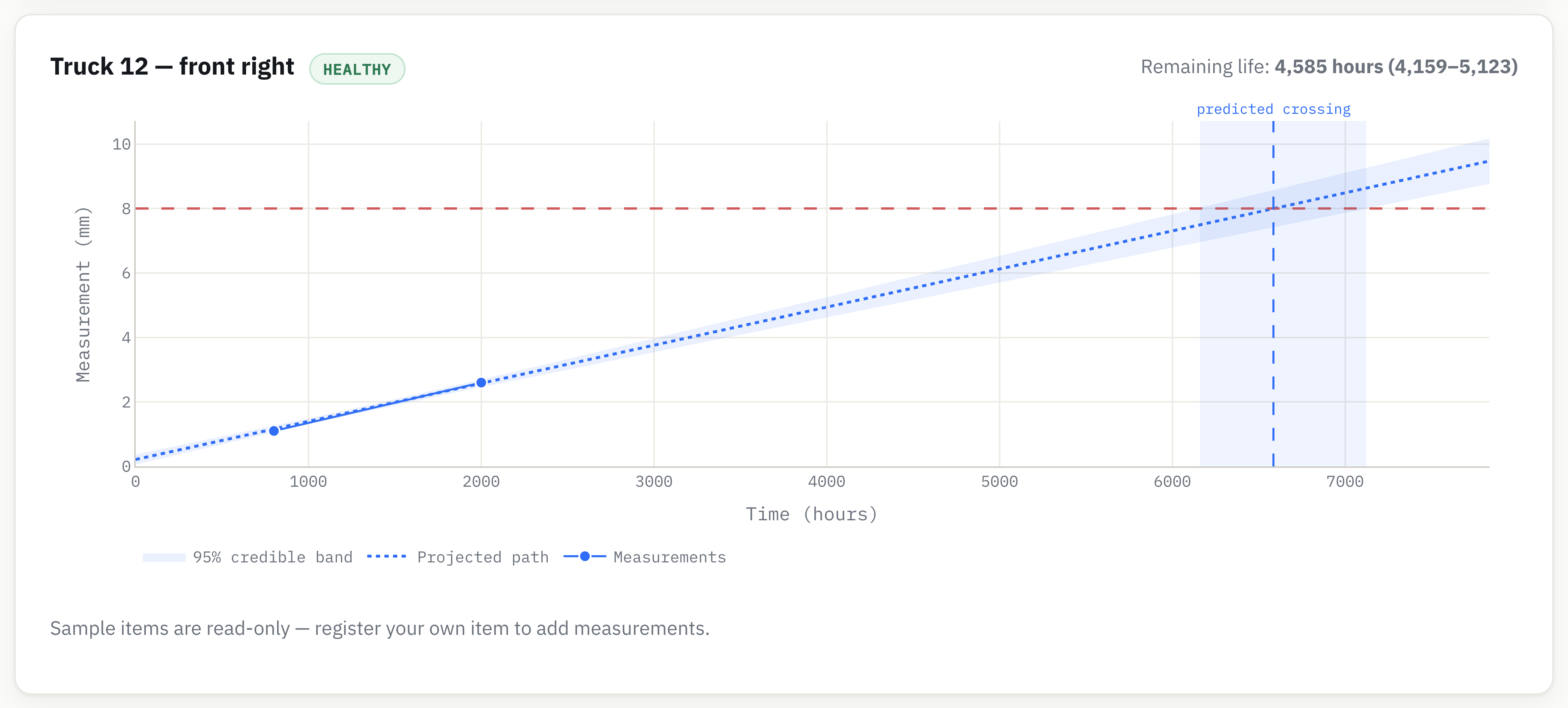 Truck 12's front-right pad: two readings, the projected wear path, the 95% credible band, and the predicted threshold crossing at ~6,585 hours — a remaining life of ~4,585 hours with an interval of 4,159–5,123.
Notice what the credible band does at the threshold: it converts "when will it fail?" into a window, not a date. The projection says the crossing is centred near 6,585 hours, but the band gives you the range to plan against. If the consequences of running to the limit are severe, schedule against the early edge of the band; if the part is cheap and the truck is easy to pull in, aim nearer the centre. The uncertainty isn't a nuisance — it is the planning information.
And crucially, the estimate updates. Add the next inspection reading and the posterior tightens around the item's true wear rate: the band narrows, the predicted crossing firms up, and an item that's drifting faster than expected announces itself measurements before it becomes urgent.
Running a fleet on this
One item is a chart; a fleet is a table. In Reliafy, degradation tracking lives in the Strategy section: every monitored asset sits in one list with its current health, remaining life, and predicted crossing, recomputed every time a new measurement lands.
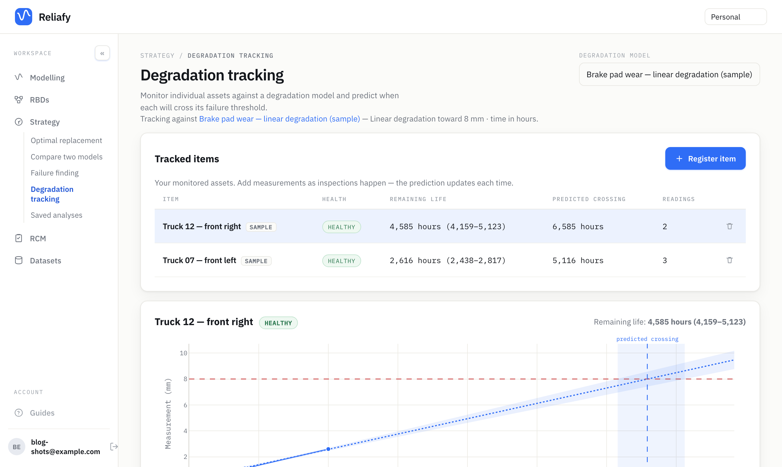 The fleet view. Each row is a tracked item; the health badge summarises how close it is to the threshold, and "predicted crossing" is the estimated failure time in operating hours.
The health badges are deliberately blunt: healthy when the crossing is comfortably far off, plan replacement when failure probability at the current age is becoming material, replace now when the item is more likely than not past due. The workflow is equally simple: technician inspects, types two numbers (time and measurement), and the prediction refreshes. No refits to babysit, no scripts to run.
To try it with your own data, you need a CSV with three columns — unit id, time, and measurement — one row per inspection of the historical units. Fit a degradation model under Modelling → Degradation & RUL (pick the threshold and path form), then register your in-service items under Strategy → Degradation tracking with whatever readings they have so far. The free cloud tier includes one degradation model and three tracked items, which is enough to run a genuine pilot on your worst actor; the open-source version has no limits at all.
Where this fits in a maintenance programme
Degradation analysis is the quantitative backbone of on-condition maintenance — the RCM outcome where you monitor a measurable parameter and act before functional failure. If you're building an RCM study in Reliafy, an on-condition decision links directly to the degradation model as its evidence: the study can show that the failure mode develops measurably and that the monitoring interval makes sense, rather than asserting it.
It also plays well with the classical tools rather than replacing them. The life model that falls out of step three is a perfectly good input to an optimal-replacement calculation for the items you don't monitor individually. And when the degradation data tells you a failure mode is essentially random — paths flat, scatter dominating — that's your cue that condition monitoring won't help, and a run-to-failure or failure-finding strategy deserves a look.
A few practical notes from the field before you start:
- Measure the right thing. The degradation measure must actually drive the failure mode. Vibration that correlates loosely with bearing wear makes a poor path; measured spall size makes a good one.
- Two readings minimum, three is better. One reading tells you where an item is; it takes two to estimate its rate, and the credible band stays honest about how little two points prove.
- Thresholds are engineering decisions. Pick the value where function is genuinely lost (or a regulation is breached), not where discomfort begins — conservatism belongs in the planning margin, not hidden in the threshold.
- Watch the form, not just the fit. If units visibly accelerate and you've fitted straight lines, the extrapolations will flatter you. Plot the paths; the eye catches curvature that summary statistics miss.
The pitch, in one sentence: your inspection sheets already contain the failure dates of equipment that hasn't failed yet — degradation analysis is just the arithmetic that reads them out. Sign in, load a wear history, and see when your own equipment thinks it's going to fail.